Thursday, May 26, 2011

#5

When the topic emotions was picked for our midterm big idea, my meaningful journey began. Always having a passion for cameras and photographs, I knew it was going to be the platform for my midterm project. However, little did I know where this simple picture would lead me. 


I started off with just a lens because of the reflections, shape, and what the capture. When looking at the lens, I really began to think about either side of the lens. Someone looking through it, and looking out on a scenery or subject. With just the use of a lens it was impossible to show both sides of the lens in a nonfictional way. So I decided to change from a lens to the playback screen on a digital camera. This lead to my modulated meaning of looking through a camera and capturing the actual image versus capturing what the photographer is seeing.


In this I have different layers in my background or different meaningful places, and the same images are layered in the camera with a picture of my boyfriend and I overlapping it. Representing that through all this meaningful places and things, I still see him. But after going through pictures and trying to find more meaning, I slightly changed my idea.


Where the background image is what everyone else sees and through the camera is what I see when I look out on the lake. Instead of adding many layers to the background like before, I subtly added my dog into the water and a script ohio into the sky. I put these in the large picture and idea because I know that I am not the only one that thinks of them when they look out on the lake. I learned a lot about myself and my emotions throughout this project. I didn't do anything technical and I think the simplicity complemented my idea and my journey throughout creating my midterm. 


What was a challenge? HA quiz #2 was a hot mess. I over estimated my skills to change an already photoshopped picture and it definitely showed. 


I don't even know where to begin on stating the problems and the obvious photoshopped points. On that note, I'm not even going to go there because it makes me cringe. But for the purpose of this blog I will focus on the frosted lips. I was trying to go for a lighter color and had the brilliant idea to draw them on, FAIL. So in the following quiz, and a little help from Brian, I used a new technique. Creating a new layer and changing the opacity and color around the lips and finally using the eraser tool to clean up the edges, I achieved a natural looking lip. 

The before and after picture compared to my quiz #2 doesn't even need an explanation. But I remember being so proud of my quiz #3 and yet when I pulled it up to put on my blog, I already can see things I would have done differently or changed. I love how I can see and feel my progress within photoshop and with creating new and fresh ideas. 


By the looks of my quizzes, I obviously come up with better ideas than executing them. Thats why my midterm, shown above, is the best example for showing of my meaning. I love creating art but I struggle with coming up with big ideas. I feel like the midterm was so successful for me because I had a little push in the beginning to point me towards a certain direction. Thats also why I struggled more with the open ended quizzes and finding a purpose to my final. 


Tuesday, May 17, 2011

Blog #4

 I was inspired by another students midterm for my final project. My family has always been a huge supporter of high school football and this year I was volunteered to make the annual poster that is hung up around town. I've been trying to come up with ideas on where and when to take the photograph and was really struggling with ideas, that is until I saw this midterm and the idea came to me. I want to take that years theme or word that gives the team inspiration and put action shots along with the composites through out the letters. With my photography skills and the techniques I've learned in photoshop I think I will be able to make something unique and professional. 

Including inspirational and motivating photos:


I want the photos to be a compilation of success, teamwork, unity, and memories. My idea is with all these photos combined it will give of inspiration. 

I also wanted to use pictures from Camp Bobcat as the background since the seniors have attended the camp every summer for the past 4 years as a team. 


I wanted to make more than just a poster with a team photo, I wanted it to inspire and bring out the best in what football and being on a team, and really what our town is like. So I came across this website for Inspirational Quotes for athletes. 

I also wanted to make the players feel like they are being showcased in the best possible light, with close up pictures and actions shots, adding more than just the most talented kids sitting down in a group and smiling. 

I want the players to feel like they are on the cover of a magazine. Having the seniors and long time players be featured in larger photos. 

Overall the basic outline for my idea is as follows:

However saying words INSPIRE, GRANDVIEW, PRIDE, etc. Also there being more than one photo per letter, being able fit more in. 

I think the biggest challenge for this project will be to get all the photos to blend and to have ever member visible within the cut out words. So to make the blending as natural as possible I found a tutorial that helps blend landscapes together along with humans which I think is perfect since I will be blending players together as well as into the background. My biggest fear is being able to fit all the players in, so I found this tutorial that will allow me to replace faces of players with others incase they are not featured and there is someone shown at least twice. Finally, sports photography is no easy task and so I found this tutorial to give me tips on how to remove complex objects from the background, which is key in the middle of football action. 

My goal is to stay away from anything plan and cheesy such as these:


I would also like to honor the seniors with personal posters such as:


Which will entail new techniques for m including high contrast on the players then cut out and placed in a heavily edited background which will have almost a gothic look. I could even go about the background by playing with the landscape layers and filters. All three techniques will be new to me.

Monday, May 9, 2011

#3

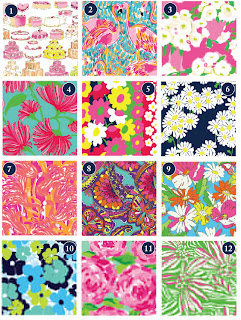
Art as inspiration? Art is beautiful and all around, whether you're looking for it or not. One area of art and expression that is probably overlooking the most would be clothes and fashion. Clothes are everywhere and anywhere, beautiful or not. 

Lilly Pulitzer just happens to be a bright and beautiful clothing line that is an art inspiration to me. The colors and intricate designs start at the drawing board, working up from paintings, to fabric, to unique clothing. 


Lilly Pulitzer herself started this major brand as a newlywed working a citrus stand. Designing this print to cover up bright stains, hence the bright patterns and colors. I love how she turned something so practical into something so beautiful and wanted. 


This huge empire of luxury clothes and accessories has inspired so many woman, and girls of all ages, to be bright and bold. This preppy look has become so popular that it has even dipped into menswear. 


Lilly Pulitzers preppy iconic look, gives me daily inspiration. I can't help but smile when looking at the great colors. It has inspired me in every way, from clothing, to creativity. I find myself attracted to Lilly-esc things all the time. 


Something, not someone, inspires me on a daily basis. Photography. Not one particular artist, or camera, or even picture. I am in love with photography and being able to capture the right moment at the right time, right angle, and right framing. I love how anyone, at anytime, can capture something great. 

Dorothea Lange is an artist that has captured a beautiful moment of raw emotion. Lange is an artist who has become famous due to her amazing photographs of raw emotion. I love this photo and the all the details in the frame, even though it is in black and white, you can see her emotion and beauty of her face. 


I love photography and I find myself looking at the world as a way of a potential photograph. Pictures can be such a starting point for many other art forms as well, which is also why I love it. I am able to take pictures myself and use them in different ways and inspiration. 


I took the photo above, and I enjoy knowing that what stands between me and the amazing photographers of the world, is experience, equipment, and connections. And not me, but anyone that has a camera in hand, and sees the world through a lens. 

Thursday, April 21, 2011

#2

Due to the fact that the website was recommended was down, I used Photoshop Star which I found by searching the internet. The technical tutorial that caught my eye was 'How to turn a new photo into an old photo' because I love history and old photographs. I downloaded an image of my family hot air ballooning because I thought that activity was fitting for am aged photograph. 


This tutorial was simple yet used many layers which was appealing to me, especially since at first the layers covered the entire image but when the layer mode was changed or the opacity, the layers created an effect on the original photo. Which made me nervous at first because I had never changed the opacity.


This was the first layer I added on top of my original image. I used filter > render > clouds to create this dark image overlaying. Then continued with the graphics and effects by creating more of a noise. By changing this layer into soft effect, the original image showed through. 


Next I added a layer of color and made it soft which gave the photo an antique look. Then scratches were added throughout the photo through image > adjustments > threshold which gave the photo a worn look. My favorite layer was using the gradient tool to adjust where the light is coming from. Giving a different angle and look of mistake or poor exposure which was common in antique photos. 


For this image, after lots of difficulty ad playing around, I thought it looked best to have the over exposure coming in from the left side. With my image looking like the picture directly above, I changed the opacity to 70% which gave me a final picture looking like it truly was an old photo. 


Through photoshop I was able to take my 2010 photo and date it at least 60 years ago. I could be working at the fair, in the old western photo booth in no time!

Monday, April 11, 2011

#1

I first thought of Barbara Kruger for this assignment even though her works were not digital, they were photographs. Not only did she push boundaries with great use of mixed media but she really set the tone for digital art, which was soon to come. Barbara Kruger stood out in my mind since we first learned about connotations and denotations because of her throughly thought out simplistic work. So simplistic that the line between connotations and denotations is very blurry. Always looking to make a statement about politics, age, gender, sexuality, feminism, society, and so on; she went into creating these great works of art with the purpose of denotations to create a shock and statement.


This piece I chose has an obvious connotations, such as many of her works due to her use of text in her art. The simple text, 'Thinking of You' overlaying a picture of someone poking their finger with a needle gives off the connotation of pain makes me think of you. Denotations bring up the idea of more broad social issues, such as suicide, gay rights, and feminism. This simple picture represents the oppression that as human beings, we put on each other.


I recently became a fan Ann Leibovitz's work when I came across her recent work for disney in a magazine. In this project she chooses celebrities to depict certain fairy tails. Who she chose to portray the characters in the stories gives a lot of denotation. Depending on the frame photoshop plays a more apparent roll than others, but overall she uses editing to create the most naturalistic portrayal of a fantasy possible.


The original connotation I had about this was hollywoods 'it' couple from High School Musical were chosen to be sleeping beauty and her prince, cute right? Not so much when the denotation is screaming FEMINISM. The real life couple also played the same role in the popular disney movies they are featured in. Stereotypical roles for each of them, Zach Effron playing the popular jock and Vanessa Hudgenson playing the geek only to be saved by Zach, giving off the idea that she couldn't survive without him. Even if you didn't know the background of the couple, the fact that she needs a man to kiss her represents the feminism idea that women NEED men. This could also be gay rights denotation, do you have to be heterosexual to be saved? Its amazing how simple  children's literature can have such deep denotation about society.